Album art, need your opinions!!!!!!
Moderators: PEPCORE, SweetPeaPod, BreakforceOne, JohnMerrik
26 posts
• Page 1 of 2 • 1, 2
- djtheblade

-

- Posts: 1354
- Joined: Fri Mar 09, 2007 12:00 am
- Location: Rigel 5
Album art, need your opinions!!!!!!
![]() by djtheblade » Fri Feb 19, 2010 5:56 pm
by djtheblade » Fri Feb 19, 2010 5:56 pm
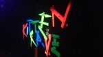
Here are the initial drafts, artwork by David Divtech, James Eraserhead, George Terrorhate and myself! All feedback appreciated (required). Cheers guys 

 [/img]
[/img]
![]() by divtech » Fri Feb 19, 2010 8:36 pm
by divtech » Fri Feb 19, 2010 8:36 pm
looks sick, fits well with the site launch and design, if i were to change anything it would be slightly increasing the spacing on the back cover text list between names
i really like the "starwars esque" distressed typeface
i really like the "starwars esque" distressed typeface


- djtheblade
-
- Posts: 1354
- Joined: Fri Mar 09, 2007 12:00 am
- Location: Rigel 5
![]() by djtheblade » Fri Feb 19, 2010 9:38 pm
by djtheblade » Fri Feb 19, 2010 9:38 pm
There is going to be one or two more variations soon, i'll post them up in this thread, would be really helpful if you guys could sort of nod towards your favourite design, then we would really know which one to put forward like. Safe crew!
- Feutus Lapdance
-
- Posts: 1107
- Joined: Tue Oct 14, 2008 12:00 am
- Location: Maastricht
- Average track rating: 4.0/5 out of 1 votes
![]() by Feutus Lapdance » Fri Feb 19, 2010 9:41 pm
by Feutus Lapdance » Fri Feb 19, 2010 9:41 pm
Looks good. I sugest jou only give the names some more space.
- meatsweeper

-

- Posts: 277
- Joined: Fri Feb 15, 2008 12:00 am
![]() by meatsweeper » Fri Feb 19, 2010 11:26 pm
by meatsweeper » Fri Feb 19, 2010 11:26 pm
Feutus Lapdance wrote:Looks good. I sugest jou only give the names some more space.
I agree, cant wait to hear it!
- cuttingagent

-
- Posts: 431
- Joined: Mon Apr 23, 2007 12:00 am
- Location: hardcorvallis, oregon
![]() by cuttingagent » Fri Feb 19, 2010 11:44 pm
by cuttingagent » Fri Feb 19, 2010 11:44 pm
yeah the tracks are a bit hard to read on the back.
the front cover is massive and loud! looks good. who did the drawings?
the front cover is massive and loud! looks good. who did the drawings?
([agent.)]

- yonosoyelquesoy
-

- Posts: 281
- Joined: Wed Dec 10, 2008 12:00 am
logo
![]() by yonosoyelquesoy » Sat Feb 20, 2010 2:35 am
by yonosoyelquesoy » Sat Feb 20, 2010 2:35 am
really great design for the cover! I dig the black and white concept of it all
- djtheblade
-
- Posts: 1354
- Joined: Fri Mar 09, 2007 12:00 am
- Location: Rigel 5
![]() by djtheblade » Sat Feb 20, 2010 9:23 am
by djtheblade » Sat Feb 20, 2010 9:23 am
We're gonna try inverting the colours on the back, not only will this give it a different edge but also it will remove the stroke, so the text me look less squashed up. It's cus we've got so many tracks that I'm sceptical about making the font any smaller to increase spacing cus it might just become even more unreadable.
- Feutus Lapdance
-
- Posts: 1107
- Joined: Tue Oct 14, 2008 12:00 am
- Location: Maastricht
- Average track rating: 4.0/5 out of 1 votes
![]() by Feutus Lapdance » Sat Feb 20, 2010 11:37 am
by Feutus Lapdance » Sat Feb 20, 2010 11:37 am
wy dont you make the back (artists and songs) with a normal pencil??
It will look much more of 1 of those Noiz cassetes.
It will look much more of 1 of those Noiz cassetes.
- djtheblade
-
- Posts: 1354
- Joined: Fri Mar 09, 2007 12:00 am
- Location: Rigel 5
![]() by djtheblade » Sat Feb 20, 2010 11:41 am
by djtheblade » Sat Feb 20, 2010 11:41 am
Yeah my first track listing design was drawn on with a pen but it was dead squashed up and very difficult to read. I considered having half the tracklist on the back then the rest of it on the inside but then people wouldn't be able to see everything at first glance.
26 posts
• Page 1 of 2 • 1, 2
Who is online
Users browsing this forum: No registered users and 125 guests