
i made my first flyer
Moderators: PEPCORE, SweetPeaPod, BreakforceOne, JohnMerrik
13 posts
• Page 1 of 1
- piercedmilo

-

- Posts: 22
- Joined: Thu Apr 30, 2009 12:00 am
i made my first flyer
 by piercedmilo » Wed Jun 17, 2009 11:09 am
it's not perfect, but I'm kinda please with it
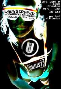
what do y'alls think?
what do y'alls think?




- piercedmilo
-
- Posts: 22
- Joined: Thu Apr 30, 2009 12:00 am
by piercedmilo » Wed Jun 17, 2009 1:58 pm
themanlikekg wrote:Pretty good,that is Ladyscraper isnt it?
yeah, it was the first image that came up in google images that wasn't an event poster

- Feutus Lapdance

-

- Posts: 1107
- Joined: Tue Oct 14, 2008 12:00 am
- Location: Maastricht
- Average track rating: 4.0/5 out of 1 votes
by Feutus Lapdance » Wed Jun 17, 2009 4:33 pm
The linup text and the Time text could be more in balance.
Make the time text more in the forfrond + make closup of the head so the linup and the name of the party springs outh of it.
The most Importand thing of a flyer is that jou now whats coming (helix + Ladyschraper......Jeaaaaa)
Make the time text more in the forfrond + make closup of the head so the linup and the name of the party springs outh of it.
The most Importand thing of a flyer is that jou now whats coming (helix + Ladyschraper......Jeaaaaa)
Last edited by Feutus Lapdance on Wed Jun 17, 2009 7:59 pm, edited 1 time in total.
- producer_snafu
- free pwny ridez!
-

- Posts: 1075
- Joined: Fri Feb 23, 2007 12:00 am
by producer_snafu » Wed Jun 17, 2009 5:27 pm
i like how i have to squint to look at it
\((( "D )))/ Yay clouds! ☁ ☁ ☁ ☁ ☁
by rtificial » Thu Jun 18, 2009 2:42 am
producer_snafu wrote:i like how i have to squint to look at it
Ok you win today, that gave me a chuckle. Nice first job, I've seen worse. I'm a big font whore so I won't go into the font spiel.
by Thallium » Thu Jun 18, 2009 3:04 am
producer_snafu wrote:i like how i have to squint to look at it
i don't. i'm even wearing glasses.
rtificial wrote:I'm a big font whore so I won't go into the font spiel.
heh yes. i'm a font nazi but i cbf getting into a typography lecture. anyway it's a breakcore flyer, it's not supposed to look like something out of my design portfolio.
@ piercedmilo - i like how you used the limited space by adding text on the glasses. that's pretty nifty. maybe put "no bad attitudes" over the bulge in that dude's pants. good work though, you should make up some fake events & get your flyer practice on. p.s. 500 x 350 is generally the correct size for web flyers.

Last edited by Thallium on Thu Jun 18, 2009 2:23 pm, edited 1 time in total.
- piercedmilo
-
- Posts: 22
- Joined: Thu Apr 30, 2009 12:00 am
by piercedmilo » Thu Jun 18, 2009 11:51 am
Thallium wrote: maybe put "no bad attitudes" over the bulge in that dude's pants
dammnit I never thought of that!
it's one side of a two sided flyer, the other side has a ful lineup and info in a nice easy to read font.
I did this in two hours with about four hours notice, so not bad I reckon. I'm not a designer by trade, but a VJ visual artist, photographer and filmmaker so I think I've done okay
by rtificial » Fri Jun 19, 2009 12:33 am
Thallium wrote:producer_snafu wrote:i like how i have to squint to look at it
i don't. i'm even wearing glasses.rtificial wrote:I'm a big font whore so I won't go into the font spiel.
anyway it's a breakcore flyer, it's not supposed to look like something out of my design portfolio.
Well I have that pencil break book which is full of great breakcore flyer/album design. I find it quite inspiring and I got it for doing some CD art for a friend. My personal favorites are Dzgnbio, droon, and whoever does the stuff for eustachian
- producer_snafu
- free pwny ridez!
-
- Posts: 1075
- Joined: Fri Feb 23, 2007 12:00 am
by producer_snafu » Fri Jun 19, 2009 6:15 am
worst flyer ever by anyone is by system of a don, that dude took some pic of a baby pushing a toy lawn mower with those balls that jump all over the place inside when ya move it and added blue ms paint text to it.
it wasn't even cool looking, it was just like some regular digital cam shot of a kid for gad sakes.
it wasn't even cool looking, it was just like some regular digital cam shot of a kid for gad sakes.
\((( "D )))/ Yay clouds! ☁ ☁ ☁ ☁ ☁
13 posts
• Page 1 of 1
Who is online
Users browsing this forum: No registered users and 113 guests