ALBUM ART VOTE, YOU DECIDE, LIKE X-FACTOR
Moderators: PEPCORE, SweetPeaPod, BreakforceOne, JohnMerrik
16 posts
• Page 1 of 2 • 1, 2
- djtheblade

-

- Posts: 1354
- Joined: Fri Mar 09, 2007 12:00 am
- Location: Rigel 5
ALBUM ART VOTE, YOU DECIDE, LIKE X-FACTOR
![]() by djtheblade » Tue Feb 23, 2010 8:58 pm
by djtheblade » Tue Feb 23, 2010 8:58 pm
Ok, here we go, two fronts and two backs. Please indicate which combination you prefer just by referring to their numbers, e.g 1 and 3, or 2 and 4, or 2 and 3 etc. If you wanna add additional feedback then go for it but bare in mind only minimal changes will be made from this point onwards. You guys are basically dictating how this goes
1
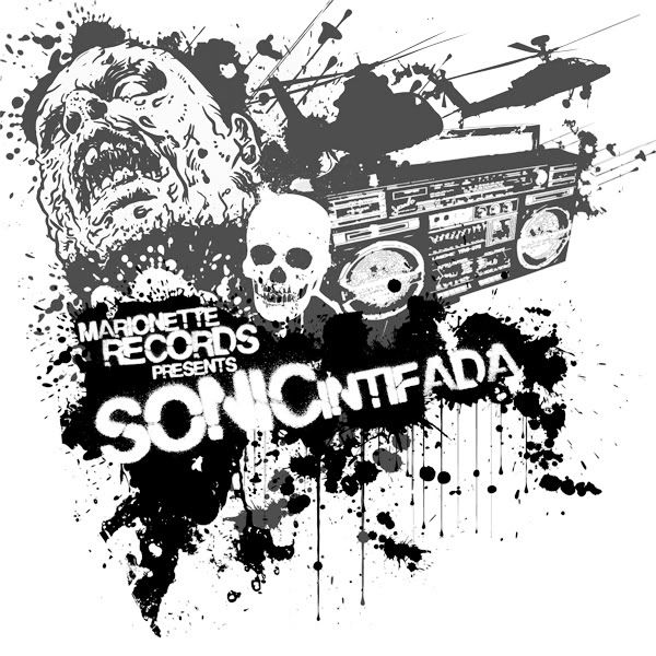
2
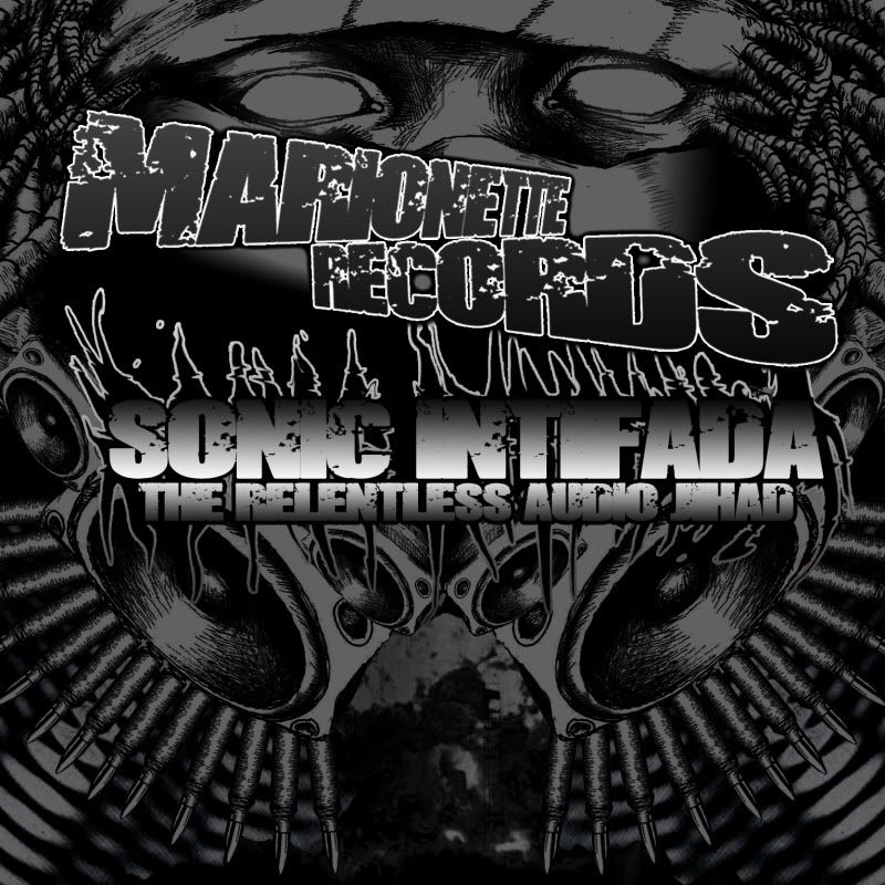
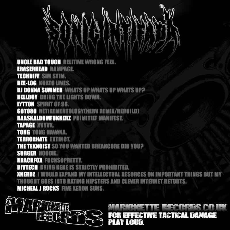
AND THE BACKS
3
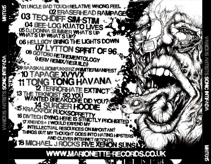
4
Calls cost 9 Iraqi dinar per minute, texts will be charged at your standard operater's fees. Lines close at 2 minutes to midnight.
1
2
AND THE BACKS
3
4
Calls cost 9 Iraqi dinar per minute, texts will be charged at your standard operater's fees. Lines close at 2 minutes to midnight.
- SweetPeaPod

-

- Posts: 675
- Joined: Sat Mar 28, 2009 12:00 am
- Location: Tri-State
![]() by SweetPeaPod » Tue Feb 23, 2010 11:14 pm
by SweetPeaPod » Tue Feb 23, 2010 11:14 pm
1 + 3 is def more artistic....but
2 + 4 is more solid of a design and easier read......
i'd have to go with 1 + 3 tho.....
2 + 4 is more solid of a design and easier read......
i'd have to go with 1 + 3 tho.....
- weyheyhey !!

-

- Posts: 494
- Joined: Wed Aug 29, 2007 12:00 am
- Location: E1 london tahhhhn
![]() by weyheyhey !! » Tue Feb 23, 2010 11:39 pm
by weyheyhey !! » Tue Feb 23, 2010 11:39 pm
I think the second design would look a lot better if you got rid of the gradient fill on the text - it makes it look kinda amateurish, which is a shame. Also gradient fills like that aren't a good idea for print media.
so as it stands now... 1 + 3.
so as it stands now... 1 + 3.


![]() by divtech » Wed Feb 24, 2010 2:32 am
by divtech » Wed Feb 24, 2010 2:32 am
i like the 3 back but something feels wrong with both of the fronts
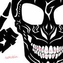
i dont like 2 and 1 looks like the skulls n splatter that iv seen on every other bcore vinyl artwork, like a conglomeration of 2 packs of photoshop custom brushes, the typeface is good but it looks really generic :/
then again my judgment is a tad bit skewed haha
i dont like 2 and 1 looks like the skulls n splatter that iv seen on every other bcore vinyl artwork, like a conglomeration of 2 packs of photoshop custom brushes, the typeface is good but it looks really generic :/
then again my judgment is a tad bit skewed haha
- SweetPeaPod
-
- Posts: 675
- Joined: Sat Mar 28, 2009 12:00 am
- Location: Tri-State
![]() by SweetPeaPod » Wed Feb 24, 2010 3:36 am
by SweetPeaPod » Wed Feb 24, 2010 3:36 am
i def think mismatched wouldn't work... too dif. then again, it's not really about the cover, right?
good job
good job
- Feutus Lapdance
-
- Posts: 1107
- Joined: Tue Oct 14, 2008 12:00 am
- Location: Maastricht
- Average track rating: 4.0/5 out of 1 votes
![]() by Feutus Lapdance » Wed Feb 24, 2010 6:42 am
by Feutus Lapdance » Wed Feb 24, 2010 6:42 am
2, 3, 4, 1.
...I realy like the art of 1, but there is a hugse problem with this design....it looks to much like the Kamikaze Clubs and piece ofs.

Its recinizeble for THIS labbel. Jou are a difrent labbel. Jou should shoose somting more Marionett
...I realy like the art of 1, but there is a hugse problem with this design....it looks to much like the Kamikaze Clubs and piece ofs.
Its recinizeble for THIS labbel. Jou are a difrent labbel. Jou should shoose somting more Marionett
![]() by divtech » Wed Feb 24, 2010 6:46 am
by divtech » Wed Feb 24, 2010 6:46 am
Feutus Lapdance wrote:2, 3, 4, 1.
...I realy like the art of 1, but there is a hugse problem with this design....it looks to much like the Kamikaze Clubs and piece ofs.
exactly what im talkin bout


- djtheblade
-
- Posts: 1354
- Joined: Fri Mar 09, 2007 12:00 am
- Location: Rigel 5
![]() by djtheblade » Wed Feb 24, 2010 7:31 pm
by djtheblade » Wed Feb 24, 2010 7:31 pm

Ok, here is a modified version, removing helicopter gunships and replacing them with Mosque minarettes, arabs on horeseback with ak47s, and a Saddam era Soviet surplus tank, to complete our arabic Intifada theme. Hoping these changes will add that pinch of uniqueness that was so very much required. Thoughts?
- Feutus Lapdance
-
- Posts: 1107
- Joined: Tue Oct 14, 2008 12:00 am
- Location: Maastricht
- Average track rating: 4.0/5 out of 1 votes
![]() by Feutus Lapdance » Wed Feb 24, 2010 9:05 pm
by Feutus Lapdance » Wed Feb 24, 2010 9:05 pm
Wel, it stil looks like a Piece of record. Like this version even more than the last 1.
I now wonder if its Sadams rotting head on the front...
...it looks like a butiful Album, good job.
I now wonder if its Sadams rotting head on the front...
...it looks like a butiful Album, good job.

16 posts
• Page 1 of 2 • 1, 2
Who is online
Users browsing this forum: No registered users and 103 guests